Tuesday, August 9, 2011

Tidbit Tuesday--More Texture

Last Tuesday I showed how lace paper could make a could textured effect when painted over.  You can also use die-cuts from machines (Cricut, Slice, etc.) or cut out shapes from scissors or punches.

But you can also create a free hand 3-D texture with Puff Paint. 


Below my textured heart I "puff" out Love and a heart (haha!)  This is still on the inside of the cover page of a composition book.  I allowed it to dry for over 24 hours. (It may be shorter, check mfg directions, I'm a better safe than sorry person!)


Then I get my paint brush ready!


I paint Love over with the same Acrylic paint as I used for the paper lace.  I mix white in (not shown) so I can match the lighter pink color.  Ideally, you would want to paint everything at the same time, so your coloring will match to your liking.


Let this dry for over 24 hours. And it's all done.  I've seen this done on paper and chipboard, also.  Keep scrolling because I did a variation of this on chipboard...


This is a chipboard B--all plain and boring.


Love these kinds of letters because you get 2 choices. (at least in the beginning ;) So I am going to decorate the block of B.


This is my experiment.  Instead of using the Puff Paint, I decided to use Ranger's Enamel Accents, which does a raised paint line as well.  It comes in white and black.


I did polka dots on the B block.  You can make lines, swirls, even outline stamps!


This is my B block finished with polka dots.  I like it like that...sort of a kraft look, but this is about creating texture and paint!  Even though texture has been created....Anyways, let this dry for a good 24 hours.

I start painting it with a shiny blue acrylic paint.  Sometimes it seems as though the enamel polka dots are resisting the paint...hmm...


There's my Walgreens bag that I used as a place to paint my B block.  I'll let it dry and then paint another coat on it.

So the possibility of resistance lingered in my mind.  I got the white puffy paint back out and put polka dots on the inside B. 

One difference I found--and this could be a patience issue--is that the enamel accents had a nice even top to the dot, whereas, the puffy paint had more of a peak.


After applying another coat to the outside B, it looks like the polka dots are painted.  But if you wanted to wipe them off for a blue and black look--you can!  (While the paint is still wet of course!)


Here are the B's side by side with the flash. 


Here they are without the flash.  You can see the peaks on the left versus a more uniform roundness on the right.  Now I have these finished embellishments for a project!  Until next time....


Friday, August 5, 2011

Robot Pages

Hello Everybody!

It's Friday which means it is time for a project!  This project has a little back story to it so please enjoy!

The papers pictured below are from the DCWV All About Boys Stack.  My mom-in-law gave me a challenge with these and other papers.  The challenge was to use these papers in layouts and to use a Cricut die cut on them.  She has the other half of the papers so she is doing the challenge too.

I have had these papers for almost a year.  Within the last week I have the first layout done.  I like to have pictures before I do the layout, but this time my creativity was pushed.  I did the layouts without any pictures.


They are busy patterns so I decided to cut the Robots paper on the left into 2 pieces (with a 3rd pc left over.)


I have a sheet of yellow Bazzill cardstock and the bottom of the Robot paper is being adhered to the bottom of the yellow paper.


On my red Bazzill cardstock the top of the Robot paper is adhered.


For my Cricut embellishment I use the Opposites cartridge and spell out "All Boy."


To add some pizzazz I outlined the letters with red Stickles.  It takes a good day for these to dry.


This paper is from Michael's Recollection papers.  This is from their Rockets n Sprockets line.  I cut a Robot head from the top row and but it between All and Boy.


This is my placement so far.  I haven't glued it down yet.  I cut orange cardstock to be 4.25 X 6.25 to mat a 4 X 6 picture.

The blue square was a possibility.  But as the pages progressed, it didn't fit anymore.


I put dimensional squares on the back of the Robot head.


I used Glossy Accents to glue my Cricut letters down.


So I cut words and a robot out of one of the other corresponding papers.  I also cut out a larger light bulb.  I put a 3 x 3 journaling square to the right of the picture square.  I inked the edges of the orange squares with Dew Drop pigment ink (rocket red).


Here are the pieces glued down. 


Here are orange mats are adhered, and the light bulb is added.  This page is done!


The second page of the layout had the robots on top.  I added the squiggle like to break up some of the red.  (You'll see the real reason as you scroll down.)  That piece came from the same Recollections paper as the robot head on the first page. 

Also, I added the 4.25 X 6.25 photo mat, inked red.  (I tried blue but it looked more like a dark green or black color so I stayed with red.)


I measured the space.  Another 4.25 X 6.25 mat will go here too!


This is an example of what inking looks like.


Here is the real reason I need the strip of paper.  As I was working along I noticed that there was a tear in my paper here on the right hand edge.  A photo mat would hide it.  So the strip was perfect.  Some of the coolest creative things comes from hiding mistakes!


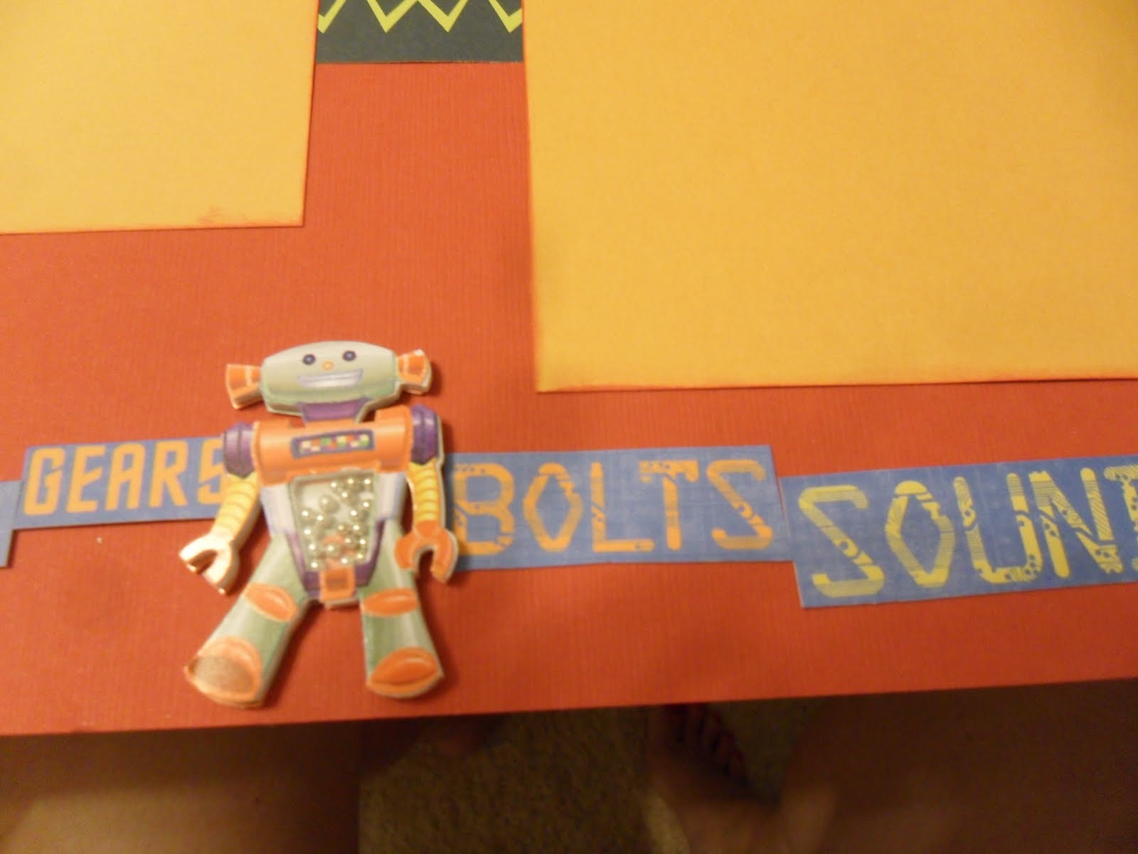
This is the page complete.  On the bottom I cut some more words out of the blue robot paper.  I cut out a green robot and put pop dots underneath him.  Then I had a Recollections robot-I added him in the middle.  Then the last thing is an expoxy sticker that says "genuine boy."  This sticker came from Creatitve Imaginations (a set of dinosaur stickers.)


The next couple of pictures are close up of the strip on the bottom.


Here are both pages of the layout--finished!  Yay!  I might add a light bulb between the 2 orange squares on the 2nd page...almost finished!

You'll see more projects from the All Boys Cricut Challenge.  If you and your friends had a scrapbook challenge for each other, please share it with me!  Either leave a comment or email me.  If you email me I will leave you anonymous.  Until next time!

Tuesday, August 2, 2011

Tidbit Tuesday--Texture

 Hello Everybody!

Today I am going to add texture to our book from Friday.  You can also use this on the cover of a chipboard album.  I learned this technique from Ali Edwards at a class (awesome by the way!)

So pictured below are what I call lace papers.  They are laser cut designs.  All 5 pictured here are from K.I.  You can get them from many places (craft/scrapbook) but I think--and double check to make sure--that Joann is have 25% off of their specialty open stock papers this Friday-Sunday (Aug 5-7th).  All of their "house paper" is 5 for $1.  I have a super Joann sort of near me, so if you have just the fabric store you may not have quite the selection. 

So you take the paper piece and cut it to fit your page or cover. The best thing to do is to apply Mod Podge with a sponge brush over the back of the lace paper.  Be sure to use an art mat or a paper plate underneath this project because the glue will come through the openings, and you don't want to mess up your work space.

Then stick on the lace paper.


I am putting the paint directly on.  I guess you would say I am applying the paint on dry because I'm not using any water.  I just apply more paint.


This isn't my favorite paint.  But I learned that I should have glued the orange side down.  The white is thin (probably all white is, but I can't blame myself!)  So the paint wouldn't have to work so hard if it didn't have to cover up color.  I had to put a lot of coats on this to cover the background of the composition page and the orange paper.


I wanted another try at the texture thing, so I made a heart shape out of the same lace paper.


I had this Walgreen's prescription bag handy so I applied Mod Podge with that underneath.


Finished applying!


Now it is on the inside cover of the composition book.  White side up you see ;)


I started painting it white.  I didn't like it.  So I added some Metallic Pink to it.  Love it!


So that's it finished.  Pretty cool, huh?  If you had heavy cardstock you might could do a little spot like this on a scrapbook page, but I would do it first then add everything.  Maybe even on a card...Hmm...I'm sure if I do it on a different project--and I'm successful--I'll let you know!  Until next time...

Friday, July 29, 2011

Regular Composition Books turned Beautiful Journal Books!


Hello Everybody!  Happy Friday!

I hope everybody got their composition book!  Now are you ready to play?

First get out your paints!

Here is my plain o' book...
Now I am applying paint.  This is the first time I used white.  I used a tan color before.


Time for a 2nd coat!


I didn't like the way the white turn out in its entirety.  So I could have put a 3rd coat on...but really I am ready to decorate!  So here is what my book looks like now.

This is the best part!  Decorating!  I used Mod Podge.  I tried to used regular Elmer's (as you see in the background), and it was just a little thick.  The Mod Podge comes out sorta fast, and I wasn't waiting!  I applied the Mod Podge with a foam makeup applicator.  I think they are cheaper than other applicators.  I have put chalk on projects with them as well.  Depending on what you are working on, you can also cut them in half to make them go a little further.


K&C Company--this is one of my favorites--die cut pieces are pictured below.  If you want the specific line, email or leave a comment because I would need to look it up.  These are definitely going on my book!


I don't care for how the paint turned out.  But it needed to be painted either way.  I also painted the edges.  Here I started putting the papers down.  I am going for a shabby chic theme so I don't know how this may finish.  I went to my scrap box and pulled papers that reflected the theme I wanted. 

What is so fun about this project is that if you want it to be Halloween..get out the orange and black.  If you want different kinds of butterflies, go for it!  You are only restricted by your creativity!


I cut the pink paper with decorative edged scissors but in the end it didn't matter.  How you lay down your papers does matter.  If I really wanted the edge to show, I would've need to lay it down last.  Also, if you use a vellum or handmade paper it can show what paper is overlapping.  You may not want that.

The watering can is floating around because I love it!  And don't want to lose it :)


So I added the grey and white which is Making Memories.  Then I added the light green at the top.  There is a yellow piece and then the silver hearted handmade paper.  If you look close you can see the green and grey papers peaking from behind the white handmade paper.    It's ok.  But next time I will be a little more thoughtful and probably put that underneath the heavier papers.

I added a square above the MM grey and white paper.  And I added a saying from the K&C Company die cuts at the bottom.

I am liking how this is starting to come together.  I paint the edges white.  I didn't bring the paper to the edge.  I don't know why, I just didn't.  By painting the edge white, you don't notice where the paper stops, and it looks finished.


So what kinds of things are you going to put on your book?  I started with this Jenni Bowlin rub-on.  I used my bone folder to apply the rub-on.  Many times they come with popsicle sticks, and those are great to use, too.

Then I was in the zone and didn't take any more photos until I was done.  But here is what I did:

Stamped a brown bird case that says "fly" on a light brown patterned paper and put it over the decorative square. 

Took 2 birds from the die-cut collection and put them above the bird house.

Added the butterfly on the left using pop dots so it is hovering.

Wrote 2011 on a pink ticket and placed it on the right corner.

Added 3 felt buttons in the middle.

Added a saying along the grey and white paper.

Added a velvetish flower at the bottom of the handmade paper.

Glued down my vintage watering can.

Glued down a few circle die-cuts.

Basically, the front cover is done.

I painted the back outside panel.  I may or may not embellish it further.  And I will paint both insides of the book.


Unfortunately, I was a little sloppy when I painted the front cover of my book.  I got paint on the first page.  So I trimmed off the painted part (luckily just along the edge) with decorative scissors.


I used a pink ink pad to highlight the cut and the edge of the first page.  It makes a nice gentle decoration.  If you are giving this to someone, this is a great dedication page to them.  You could put in a picture of the two of you and write a sweet message.  Sign your art work also!  And don't forget the date!


Here are a couple of other books I have done.  These both have corresponding inside pages that were done.  I didn't do the back pages probably because I was keeping them.  So I'm sorry I don't have finished images of that.  But you could paint it, put one piece of paper that fits and write "The End" on it (or use stamps, stickers, die-cuts, etc.) 

This is my creative journal.  I use it a good bit.  There is the occasional grocery list in there too.  The green trim is beat up because of my cat :)


The inside.  This is just one sheet of paper.  They are not different recipes, but you could do that if you wanted!

This is a question book and our answers.  When we go on long trips we have questions like, "If you could live anywhere--where would it be?"  And we put our name, date and answer down. 


The inside.  The owl is a stamped image cut out.


 I hope that you have enjoyed this project!  Until next time!